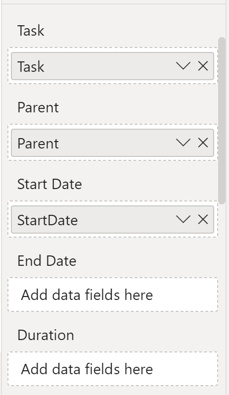
On a project recently, I wanted to use Microsoft’s Gantt chart visual for Microsoft Power BI. Try as I might, I couldn’t get the visual to accept an end date or duration. I could drag a column from the data model over to the field box for End Date or Duration but the field would not “drop” into the field box. Instead, when I’d let go of the mouse button, the box would stay empty.
I built a small test Power BI report + dataset from scratch, and the Gantt chart visual worked fine—no problems with configuring it by dragging and dropping fields.
Why wouldn’t this Gantt visual work with my existing Power BI report, but work just fine with the test report?
Calculation groups were present, which disabled the creation of implicit measures.
Why?
Why did this cause a problem? As of this writing, there are several fields on Microsoft’s Gantt chart that can’t directly contain columns from the data model, but instead expect to hold measures. The UI doesn’t display any graphical clues indicating this requirement. Instead, if column is dragged into one of these fields’ boxes, an implicit measure is automatically created for it—a seamless user experience.
That is, so long as implicit measures are allowed to be created. When they’re not, the drag and drop quietly fails, with no explanatory error message displayed.
Solution
It’s simple: Manually define the needed measure, then drag it into the field’s box. Explicitly defined measures work fine for drag and drop, even when implicit measure creation is disabled.
Thanks to Bernat Agulló for giving me the clue that led to figuring out this enigma!

